
Amplitude is an amazing product analytics platform for in-depth user behavior analysis and product optimization. Today, I want to offer advanced tips and tricks for how to use Amplitude to maximize your insights. We’ll dive into key metrics like DAU/MAU, trendlines, churn rates, and user segment comparisons.
DAU/MAU
What is DAU/MAU?
DAU/MAU is a popular metric for user engagement, answering the question, “what percent of my monthly users are active on a given day?” A high DAU/MAU ratio signifies a large portion of your user base interacts with your product daily—a critical factor for platforms like Instagram and TikTok. Generally, apps with a DAU/MAU ratio above 20% are considered good, while those exceeding 50% are deemed exceptional.
How to create DAU/MAU in Amplitude
To show DAU/MAU on Amplitude:
- Create a basic chart.
- Set Events to Any Active Event and configure your chart to display Daily data.
- Go to Formula and type in the formula: %:UNIQUES(A)/ROLLWIN(UNIQUES, A, 30)
This formula yields a DAU/MAU ratio chart for any selected day.
.png)
Here's how to interpret the formula:
- ROLLWIN(UNIQUES, A, 30) takes the number of unique users in a rolling window of 30 days.
- UNIQUES(A) takes the number of unique users on a given day.
- %: makes the chart a percentage, instead of a decimal.
Trendline: Deciphering Chart Volatility
When a chart has high volatility (zig-zags up and down), it’s sometimes hard to see if the trend of the chart is going up, down or staying the same.
.png)
In Amplitude, you can use the trendline formula to run linear regression on any chart.
.png)
The formula looks like this: TOTALS(A);TRENDLINE(TOTALS(A))
.png)
The TOTALS(A); is there to show the original chart as a reference, and TRENDLINE(TOTALS(A)) is to calculate the actual trendline. As a side note, Amplitude is calculating the trend line using ordinary least-squares linear regression, which just means to takes into account all data points, working much like an average. This means if there’s ever a datapoint that is disproportionally high or low, it will affect the trend line trajectory. Other common linear regression models use median-based formulas, which will essentially ignore outlier data to focus on the general trend, but these other formulas aren’t available on Amplitude.
User Churn rate
Churn rate is a metric that calculates the number of users or customers who leave a product over a given period of time, divided by the remaining number of customers. If you have 5% churn this month, that means 5% of your users that were active last month, left this month. Churn is either calculated by engagement (whether the user is active) for users, and by payment for customers.
To create a user churn rate chart, create a lifecycle chart, and then:
.png)
- Change the time frame to your desired choice. It’s usually 1 calendar month
- Change the chart type to Percentage
- Remove New Users, Current Users, and Resurrected Users from showing up on the chart.
And viola, we have ourselves a churn rate chart.
.png)
We can even see if the churned users were New Users, Current Users, or Resurrected Users by selecting Dormant here.
.png)
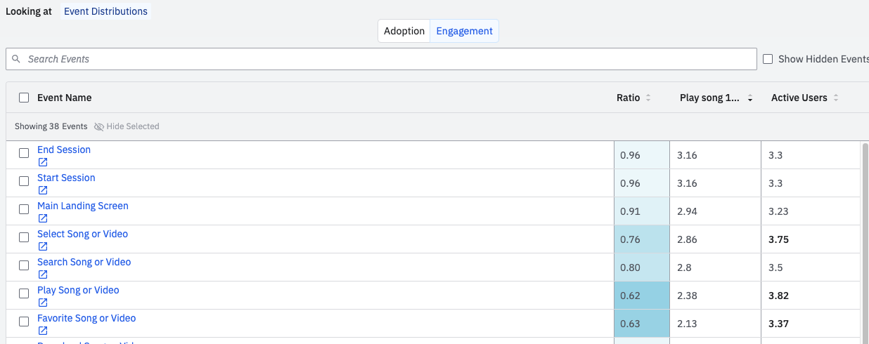
Comparing Engagement of Two User Segments
There’s a really good way to compare two user segments to see how they differ in what actions they take, and how many times they take the action.
To get started, create a cohort you want to get insights about. In this example, I created a cohort of users who played 1~5 songs in a given month to see how they differ from general active users. After you’ve gone into the cohort, go into the cohort details page, then:
- Click Comparisons
- Choose the other Cohort you want to compare to (in my case I chose all Active Users)
- Choose to look at Event Distributions
.png)
Now you’ll be able to easily compare what percent of each cohort did performed an action, and even the difference in ratio between the two cohorts. For example in the image, we can see that 18.7% of the Cohort “Play song 1~5” performed the action Upgrade Plan compared to Active Users, and that’s a 2.25x difference. The blue gradient color-coding helps us see which events have the biggest differences.
.png)
If we select the Engagement tab on the top, you’ll be able to compare the average amount of times the action was performed, between each cohort.
Conclusion
Mastering these metrics can significantly elevate your product analysis and user engagement strategies. Whether you're a seasoned data analyst or a curious product manager, we’re always learning how to extract even more insights from our data. I hope these tips helped, and if your company could use more help in unlocking insights for Amplitude, reach out to us at any time.
Happy analyzing!

